I thought it would be interesting to review what I tried to learn from books in the past. Learning is probably the easiest if you can learn it from a mentor by direct participation. Nevertheless, we put a lot of stuff in books and have people (like me) learn from them (sometimes as part of other/additional ways of learning like lectures, internships…)
My first post will be about learning graphic design from a book. It is “Visuelles Gestalten mit dem Computer” by Lewandowsky and Zeischegg, rororo, 2002. Graphic design seems to be an unusual craft to learn from a book.
The title “Visuelles Gestalten mit dem Computer” (“Visual Design with the computer“) does also sound like step-by-step photoshop tutorials better suited for learning where to click rather than teaching graphic design.
While there are some step-by-step suggestion, the book focuses on exercises in design by using simple elements like color, dots and rectangles. Thus, it is similar to the Bauhaus-Vorkurs. Most exercises are to be done in a vector graphics program like Illustrator, but they are not bound to a specific computer application and I could have done most of the exercises with crayons and scissors, too.
I was surprised to see today that the files date back to 2003 and 2004. I must have been 16 years old, 9th grade in school and seemingly I took a strong interest in graphic design, enough to work my way through roughly 60 visual exercises that consisted of arranging lines in "tense" or "relaxed" compositions and coloring rectangles to convey "anger" or "happiness".
The book suggested to do most of the exercises in Freehand, an application I did not have. However, only a few exercises could not be done with my application, Corel Draw, which I started using with the trusty old version 5 (which could easily run on my first computer, a 100mHz AMD) and, when I did the exercises, probably in version 8 using a 350mHz Intel PC (like the first computer, handed down to my by my dad, after quite some negotiations). While I probably would have been assuming I was doing it “wrong” as a beginner when using anything else than the recommended application, the goal of the exercises was very clear and the usage of the application that much in the background that it seems to have been no impediment for me.

Finding visualizations for words
In an actual real-world folder are some printouts from the graphics I created. Some exercises suggest to print them, e.g. to put them on the flow and to look at them from above (p70). Others included having someone else doing the same exercises and compare with one’s own results (p.144) or to show the results to others and see if they had the same impressions as oneself of "tense" and "relaxed" as expressed by arranging a rectangle and a line in a little square frame (can't fine the page for this). I assume that I asked my mom if I needed that other opinion.
The book has exercises as well as general theoretical introductions. The introductions have a very precise, though abstract style, stating things like ”Eines der wesentlichsten Gestaltungsmomente ist das Festlegen von Proportionen. Proportionen sind…“ (p62) (“One of the most essential design aspect is the determination of proportions. Proportions are…”). The text highlights that it is important to create “ausgewogene Gewichtung” (Balanced emphasis) to give “Bildnerische Überzeugungskraft” (“Artistic power to convince”). I do not remember how I thought about these texts as a 16 year-old. I might have assumed that there are these things expressed in these words and if I do as I told I will be able to make them happen.
The instructions for the exercises are precise and dry, too. However, they leave few questions – unlike phrases like “Bildnerische Überzeugungskraft”.
I revisited the book again in 2009: As a folder’s name indicated, Wiederholung_2009 5 years after my first attempts, I have redone some of the exercises. This was when I was was to apply for university – or possibly just having free time. Some years later, I repeated similar exercises in design school. Since then, I never did something like this again. The exercises are unique to design education. I have learned some tricks of the trade later from friends and by designing books, posters or websites. Graphic design never ceased to be a part of my life, but it was always a part of something else and never was the activity I was doing.

Experimenting with how color creates space

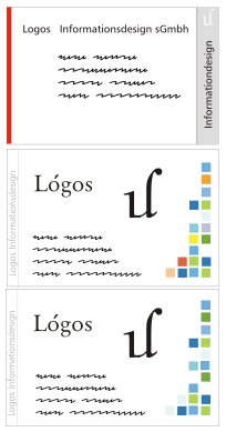
Visualizing words with the words and an rectangle

“Attention, wild animals!”

Visualizing “Movement”

Visualizing words 2004

Visualizing words 2009
…for the unlikely case that you have use of such exercises (e.g. you teach visual design), here a .zip with most of my designs, Licensed under CC-BY 4.0.
Updates
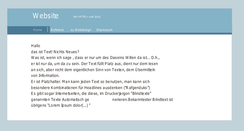
Looking through old files… I seem to have been rather actively designing in 2004. I found what was one of my first design jobs, a handout and matching business card for the business of a friend of my mom. I seem to have passed it to her via a floppy disk, which also had my instructions of how to print doublepage, written in HTML.
In 2005 I also considered starting a small business with a friend of mine to do more designing. I have created several drafts for business cards in different styles logos and a distinctively early 2000s webpage mockup. I loved that logo made from parts of characters (The “cut letters appart” exercises from the Visuelles Gestalten-Book had an impact on me)
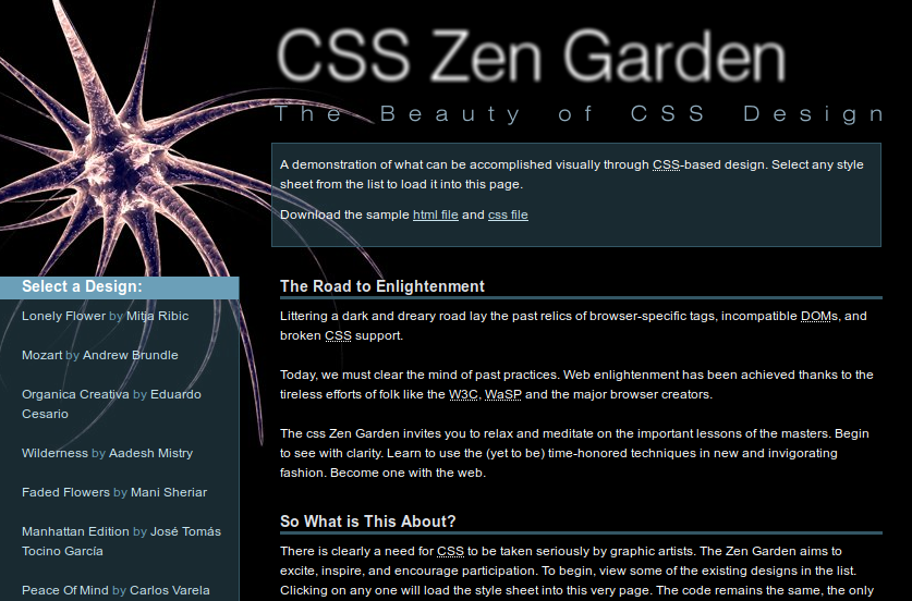
In 2006 I wanted to hand in an entry to the CSS Zen Garden. It still looks OK. The font is far to small to be easy to read. The menu and the text start at the same height, that was not difficult, but annoying to code. The microbes were created in Cinema 4D 9 and, as one can see, it came with pretty great shaders for the microbe-look.
I never handed the design in for some reason (seems I stopped mid-iteration).
Updates 2: (2021-02-12)
I scanned the printouts, mentioned above. I mentioned above that I showed the compositions to my mom. I vaguely remember that this was something where I wanted to follow the book, but which I did not enjoy: My mom was and is not sooo much interested in graphic design or abstract composition so I did not want to bother her, I guess. I felt similar when I read “Drawing on the Right Side of the Brain” recently. It suggests to have people sit still for you so you can draw them. I probably could convince friends, but as long as they do not draw portraits themselves, it is not an activity they will enjoy much, I assume.
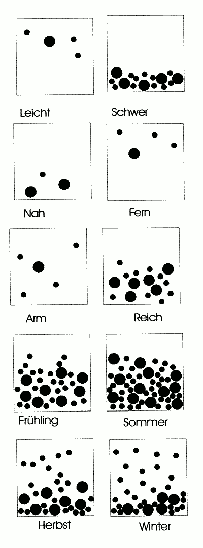
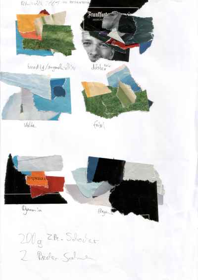
There are also some non-computer based exercises. One is creating moods with colors like happy, dark, cold, fresh, dynamic and elegant (and a part of a recipe I quickly wrote below):
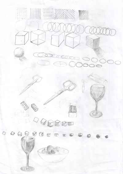
Other exercises were simple drawings and perspectives:

Updates 3: (2023-09-09)
At LinkedIn, Erica Hall asked about what designers “credit with sending [them] down the path”. This got me thinking a bit what that might be, since buying a book about visual design with computers means that I was interested in it before the book. I guess, a major influence was playing with MS Paint and later CorelDraw! (which I think my first computer, which I got aged 12, had installed in version 5). Most people around me used computers for writing and calculation and some occasional games, so it has probably really developed from using the “Toys” that I had and then, over time, gravitating to the ones that allowed working visually. MS Paint seems fairly limited (and it is). However, it allowed for some techniques like drawing a long and overlapping line with the selection tool or wild line work, which then could be filled with the flood fill, both leading to shapes being organic and geometrically looking at the same time, like some vaporwave Miró. There was also some way to load icons (or I found out to make screenshots?), where were incredibly interesting to dissect: 32×32 and 256 colors used to express a lot of concepts. I learned quickly that a lot of work must have gone into these—it was incredibly hard to recreate icons of similar quality.
It is probably not an unusual story, but what I noted is that it is an unprofessional one, being far removed from how designers like to talk about their work: There were no abstract goals to strive for, no academia, no other designers involved. This is okay for a kid, but “it is fun to play with [a tool]” (or: “I am fan of [character] and drew them”) quickly become things to assign to a past one has overcome.
See also: Professional Regression in UX on professional values and development

Learning from Books: Graphic Design by Jan Dittrich is licensed under a Creative Commons Attribution 4.0 International License.