Reading papers and reports I often see diagrams that are used to visualize values of different categories – e.g. the average hours spend for university-work per week of students of different subjects. It seems rather intuitive for me to use a bar chart: One category (e.g. subject), one value (e.g. 34 hours) and one height of the bar to visualize the value.
However, I often see line graphs being used for that purpose.
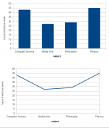 same data; two visualizations: Bars and lInes
In the example below, the line graph suggests that there students who study partly Computer Science, partly Media Arts and that these students work roughly 35h per week. As well one could assume some kind of order or continuous value on the x axis like one is used from diagrams that put the time on the x-axis.
So I see no reason to use line graphs for values-by-category-visualizations. They rather confuse and mislead the reader.