I sometimes review slides and text documents for others. There are some areas where some simple changes can improve the look and feel a lot.
Check for consistent use of fonts
When you copy and paste text you easily end up with different fonts in the same documents. Often they are only a bit different, which makes the text look somewhat off without you being able to exactly pinpoint the problem.

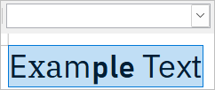
The mix of fonts happens because a pasted text often maintains the font and formatting of the source. After pasting, you have the font from your current document and the font of the source document. You can find out if you have this problem by selecting text and looking if the font selector of your program shows just one font name (good) or several or none (bad).


You can avoid such problems by pasting with the keyboard shortcut Ctrl+Shift+V which pastes without formatting or the corresponding entry in the edit menu, often names “Paste Unformatted” or similar. You can fix existing problems in three ways:
- Selecting the text and re-applying the correct font and font-height. This works in any application.
- Selecting text and then removing the formatting – if there is such a command.
- Using the format-painter tool if it exists. It’s icon looks like a paint brush or paint roller. You place the cursor in a correctly formatted word, click the paint roller icon and then select the offending text. Its formatting will be “painted over”.
Alignment: Elements should have same distance from page borders and to each other.
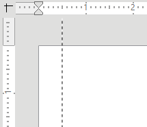
It looks messy if an images are placed in varying distances to each other and the page’s edges. Many applications help you to fix this: They have rulers that you can use to drag and drop snap-lines that stay constant between pages or slides. Define one or two and use them consistently.

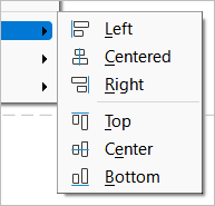
Even if you do not use a snap line, you can still align elements to each other: Select the element and use the align function. This moves elements so they all start or end at the same top or left position. Sadly, it is at different place in different applications.

Justified, unhyphenated text
Usually the worst offender of the text problems. Justified text ends the text flush on both sides of your writing area. But words have different lengths. To make the line end at the same distance every line despite of different word-length, application will adjust the spaces between the words. This results in ugly holes in your text, particularly if you use longer words.

One fix is to turn on hyphenation, which alleviates the impact of long words. However, this works only in word processors and does not solve the problems in all cases. The better solution is usually to align the text to its standard side (left in English) and have the word on the other side end when they end without forcing them to a position.

Line-spacing
Line-spacing is the height of the space between lines. The default is often a factor of 1 or 100%. You can change the linespacing in the settings for the paragraph format, but to have a consistent line-spacing, it is better to adjust it at the paragraph style (if you are using a word processor) or on the slide template (if you use a presentation program).

A decent line-spacing helps to jump to the next line in reading. 1 is usually far too tight; I usually go with 1.3 or 1.4. The best setting depends on your situation; If you have longer lines (think A4 or letter width) you should use a larger spacing like 1.4. Same goes for smaller font sizes.

Conversely, lines that are short (think columns in newspapers) do well with smaller line-spacing like 1.1 or 110%. Same goes for large headlines; there, a line-spacing of 1 can be fine.


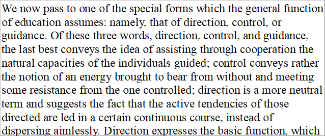
In case you really need to put a lot of words in a limited space, do not reduce the line height. Rather choose a different font (Times New Roman is efficient), reduce page margins or choose a smaller font size.
Conclusion
That should fix the worst problems in short time. The document will not necessarily look awesome, but probably less messy. There are two next steps you can do to improve the look of your documents. One is to learn the application you use well so you know the features that help you to avoid problems and to set up well-working defaults. The other is learning more about typography.
Notes:
- 2023-01-10: Fixed some small spelling problems pointed out by a helpful twitter user.
- 2023-03-21: Fixed some more problems pointed out to me (inconsistent spelling and word repetition)