If you do anything related to research and data you will have been in contact with numerical summaries, like average, standard deviation and – more complex and more often abused – the sacred p value, tool of truthiness creation in quantitative research. By reducing your dataset to a single value, you reduce the data you need to look at greatly. But, like with any reduction, you loose a lot of information. In the case of statistics, this data can be quite valuable and useful. Take a look at these datasets, named III and IV. They have very similar summarizing statistics:
| III | IV | |
|---|---|---|
| mean | 7.5 | 7.500909 |
| min | 5.39 | 5.25 |
| max | 12.74 | 12.5 |
| sd | 2.030424 | 2.030579 |
| length of sample | 11 | 11 |
| correlation* | 0.8162867 | 0.8165214 |
| linear regression: f(x)=n+m*x | 3.0025+x*0.4997 | 3.0017+x*0.4999 |
(*correlation: Pearson Product Moment Correlation)
.
But the underlying data is quite different:
| III | IV | |||
|---|---|---|---|---|
| x | y | x | y | |
| 10 | 7,46 | 8 | 6,58 | |
| 8 | 6,77 | 8 | 5,76 | |
| 13 | 12,74 | 8 | 7,71 | |
| 9 | 7,11 | 8 | 8,84 | |
| 11 | 7,81 | 8 | 8,47 | |
| 14 | 8,84 | 8 | 7,04 | |
| 6 | 6,08 | 8 | 5,25 | |
| 4 | 5,39 | 19 | 12,5 | |
| 12 | 8,15 | 8 | 5,56 | |
| 7 | 6,42 | 8 | 7,91 | |
| 5 | 5,73 | 8 | 6,89 | |
(Data 3 and 4 from Ascombe’s Quartet)
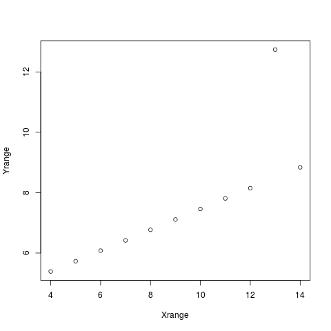
You don't see it? Sorry. Just by showing the numbers (and it’s a relatively small dataset!) you don’t gain much – have access to the information does not mean, that you can comprehend it. Let’s try a diagram:
 Image: Ascombe Dataset 3
 Image: Ascombe Dataset 4
Now it is clear.
And you see that, contrary to what the summarizing statistics suggested, the datasets are very different. (OK, you might have guessed so, the summaries were suspiciously not different). In real live it is rare to see datasets that are so different while having the same summarizing stats but it tells an important point – the numbers can be totally clear and right and nevertheless tell you not what is important since they reduce information away in order to create that single value (like r, p or sd) from many values.
So, what is lost in diagrams? Certainly we have no clear cut numbers, like that the correlation is r=0.351 or so; you can only estimate it in terms of »strong« or »weak«. But if you don't have a specific case in mind in which the absolute number would be essential your estimate will do well too. It is an uncertain estimate. But uncertainty is an important attribute in statistics that is often not obvious since the values are so clear.
So, these are the points:
- Summarizing statistics reduces (sometimes crucial) information away
- Using diagrams you can oversee the data and spot unusual or interesting properties that might not appear in summarizing statistics
- Diagrams can show many properties like spread and correlation in an accessible way. In particular, it conveys uncertainty.
There are all sorts of diagrams that may help you to understand your data visually. I only describe some here, which I consider useful and graspable for beginners.
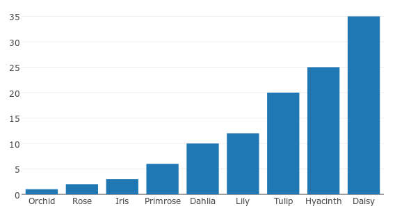
For category counts: Barchart
If you data that falls into different categories, you can use a barchart to visualize how many data points there are of each category.
 Image: barchart showing number of each type of flower that are in... a flower shop or whereever
Why not… a pie chart?
- Pie chart only work well for percentual data (The whole circle is 100%);
- Comparing categories is difficult (you can't compare height you need to compare angles. Duh.).
- For many categories (3+) its even harder to read them. So, as long as you don't show voting stats for Democrats vs. Republicans, don't use them.
How is my data distributed?
If you measure many values, you want to know how they are distributed: Are there many really high values? Few average ones?
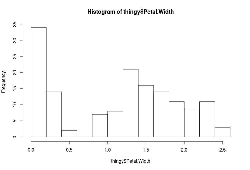
Use a histogram. A histogram shows you how many data points fall into a range. See this example: (measurements in cm)
 Image: Petal width histogram (Iris Dataset)
Notable :
- There are two ranges: one between 0 and 05, the other between 0.8 and 2.5 with the most in range are about 1.2 to 1.6 in width. Why is that?
- The distributions of these two ranges is different:
- The 0-05 is heavily skewed towards 0 – but it is not possible that there are widths of 0- So is a finer resolution of the histogram needed how small values are distributed or is it even so that very small widths are not measured precisely?
- The distribution between 0.8 and 2.5 seems normal-ish but skewed towards to about 1.5, with a longer right tail.
Why not… Boxplots?
Boxplots are nice, but I think they have a severe weakness for beginners: More values in an value range are represented by a smaller area in the diagram. That is counterintuitive imho. More should be more. Also, the »Whiskers« can represent different values, so you need to check what they mean.
Is there a correlation?
A correlation means that you can predict something. If you want to know if someone reads a lot, the number of books that person has, may be a predictor. You can visualize a correlation using a »Scatterplot«
Imagine, we measured how productive a programmer is (in lines of code [^ which is not an ideal measurement, but let's go with it for the example]) and which kinds of books the programmer owns. In this (made up) example, we find a strong, positive correlation between lines of code written and programming books read. If the correlation is very strong, data will follow a clear pattern around a (imaginary) line:

But it could be the case that writing many lines of code is correlated with reading books in general. A programmer who owns many books of any kind would than be likely to be a programmer writing many lines of code. In this made up example, this does not hold true and the correlation is weak: you only have a indistinctly formed cloud of data:

(Please keep in mind, the data is made up. I don't know if there is or is not a correlation between lines of code and different types of books one owns)
Scatterplots only makes sense if your values are measured on a continuous scale like height, width etc.
If one variable is continuous and the other measures distinct groups like male/female or pupil being in grade 1, grade 2 etc. it does not make sense to use a scatterplot: Data mainly overlays itself. There are some techniques for making this work nevertheless, but an easier way is to use several histograms and compare the means or medians.
Applications
While the most of these diagrams are around since several decades, the software support is a bit fragmentary.
Usually, you can get along quite well with Excel or Libre Office Calc – but you need some (minor) skills in these applications: for making the diagram you want, sometimes you may need to use the function for counting values etc.
Tools like tableau or plotly may be easier: They are focused on creating diagrams. I would recommend plotly, since at least their underlying library is free.
Tools like RKWard, a statistics program, may seem overkill, but for diagramming they work surprisingly well, at least if you are fine with the standard diagrams – they don't look beautiful, but they are useful.
Nevertheless it is surprising, that there are so few really user friendly tools in an area which combines two things computers are really good at – calculating and displaying stuff.
Update 2018-12-01: I now would use jamovi instead of RKWard. I would also suggest to try voyager for exploring small-to-mid-size data