Here you can find design and research projects of mine. Just in case: you can as well have a look at software I wrote
User Research: Wikidata Use in Cultural Institutions
Responsibilities:
- Research Concept
- Data Collection
- Data Analysis
- Communication
Wikidata is a flexible knowledge base and one of the software products which is created by Wikimedia Germany. It is used to share data between different Wikipedias but also has become more and more popular in cultural institutions. Me and several co-researchers from different teams at Wikimedia talked to 16 users who worked at different cultural (“GLAM”) institutions to find out about “How and why do people in cultural institutions use Wikidata?” and thus learn more about participants’ motivations, activities and problems. I summarized what me any my collegues learned in this report.
The research is a good example of exploratory, general user need research. You can read and download the report at Wikimedia Commons
A Beginner’s Guide to Finding User Needs
- Teaching Concept
- Writing
- Design
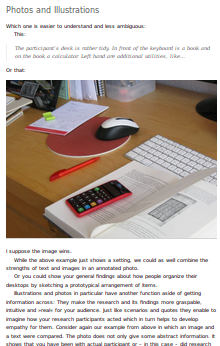
A text written for all those who want to design products according to the needs of human beings. It covers recruiting, interviews, observation, data analysis and reporting. It is written in a hands-on manner and has lots of examples.
Since it has its origins in teaching design students, it does not require the learner to spend much on costly equipment or services. The text itself is free (CC-BY-4.0)
Design System for Wikimedia Deutschland Donation Page
- Revision of existing design
- Creation of design system in figma
- Collaboration with developers for implementation
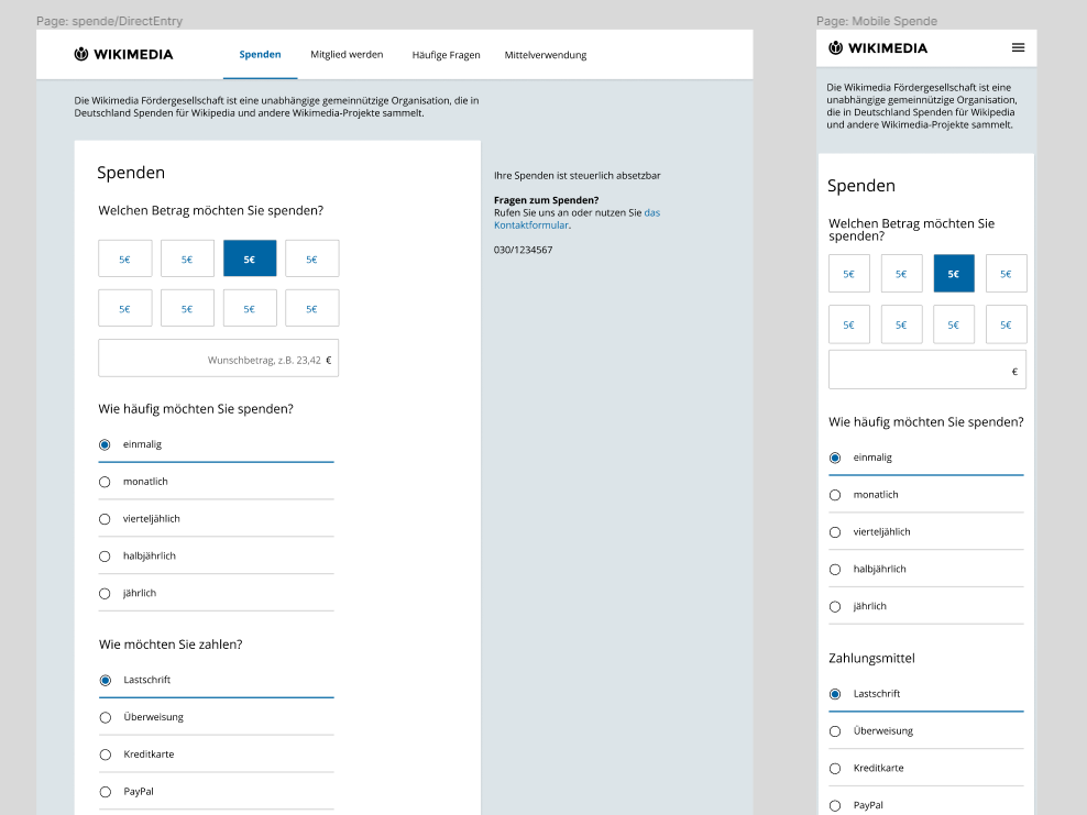
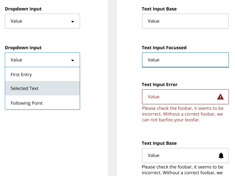
In 2019, Wikimedia Deutschland implemented their donation page in vue.js and introduced a design system. I based the visual style on a previous design, but improved the accessibility with higher contrasts and clearer semantics for component states. I created the design system in figma and structured it according to atomic design principles.
User Research: eLearning
Responsibilities:- Research Concept
- Data Collection
- Report
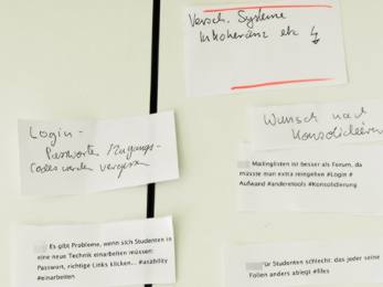
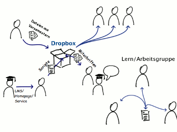
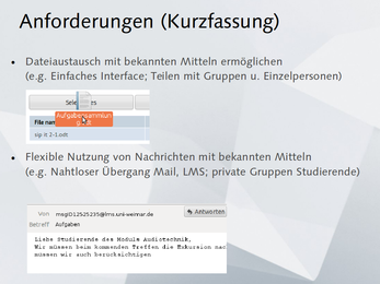
The research helped to focus project resources on topics relevant for student's learning: distribution of learning materials in the form of files and communication were key concepts for the students. Project resources could be allocated to these core topics that might have been neglected otherwise.
Teaching: Human Centered Design Research
Responsibilities:- Teaching Concept
- Teaching
- Contact to Mentors
For three terms I taught basic skills for Human Centered Design Research, including interviewing, observation, data analysis, idea generation (based on the earlier research, naturally!), paper prototyping and user tests.
I taught lightweight methods suitable for the student projects. To teach new skills I used educational scaffolding including worked examples, exercises and »how-to-cheat sheets«.
Students used a wiki for documenting and presenting their projects and for exchanging information.
Each term we cooperated with another company or foundation which provided the design brief and mentoring:
- The university’s library (Service Design focus, Class '12/'13)
- Creative Commons Foundation (Web platform focus, class '13)
- Guardian Project(Mobile Interfaces and encryption, Class '13/'14)
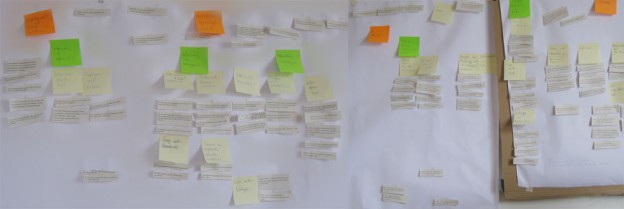
During the three terms the class has been constantly evaluated and improved using an action-research approach. I collected data via feedback rounds, questionnaires, interviews and evaluation of deliverables. For analyzing the data I used affinity diagramming. The research triggered several changes like an introduction to tools for collaboration, improvement of teaching material, the creation of templates and the shift to interactive workshops for learning skills.
On the wiki which we used for organizing the class are examples of
students’ works as well:
See also: https://blog.mozilla.org/ux/2013/08/bauhaus-wrap-up/
User Research and Usability Evaluation: Medienwiki
Responsibilities:- Usage Analysis (Interviews, Web-Analytics)
- Touchpoint Analysis
- Design Concepts
- Usability-Tests
- Programming (CSS/Javascript)
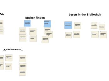
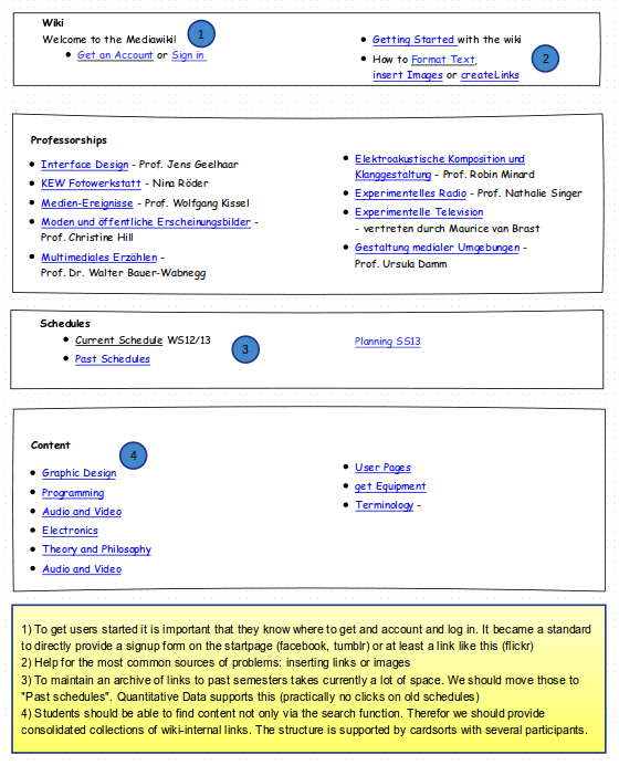
The medienwiki is an important part of the eLearning strategy in the Media Arts and Design course of the Bauhaus University. I prepared a redesign of the platform. I analyzed the students use of the system with qualitative methods and web analytics. Core problems were identified using this mixed-methods design:
- It is difficult to add images though it is often needed.
- Information is hard to find
- many functions are not used (and visible in the Interface) while others are often needed but hard to locate.
- Students must be reminded by teaching staff to add a license to their content
Results:

Interaction Design and Research: Hold-And-Move
Responsibilities:- Gesture Concept
- Data gathering
- Prototyping
- supporting data analysis
- academic writing

In this work, we designed, implemented and evaluated a new gesture for mobile devices. The work was done with Alexander Kulik We published the results on the ACM MobileHCI '12.
The hold-and-move gesture allows seamless switching between navigation (panning/scrolling) and manipulation on touchscreen devices: While a single touch still pans and scrolls (e.g. a list of songs) an additional finger will move items (e.g. a list entry when resorting a playlist).
Without hold-and-move, this switch from scrolling to dragging items is usually achieved using a cumbersome ›long-tap‹ gesture.
The hold-and-move gesture runs on off-the-shelf multi-touch devices and does not need on-screen widgets. It is build upon natural principles of interaction: Holding something in place with one hand, doing manipulations with the other – just like one does when repairing a small device or when writing on a sheet of paper.
The research was published in the proceedings of the ACM MobileHCI '12 (read the preprint-Version).
For examples, go the Hold-and-Move Webpage . It even has interactive demos you can try on your smartphone or tablet!
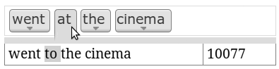
Usability and Interaction Design: Netspeak
Responsibilities:- Usage Analysis (Web-Analytics, Interviews)
- Prototyping
- Usability-Tests
Netspeak is a web-service which offers the search for suitable word in the context of an existing sentence. The service demands interaction by writing in query syntax. In the redesign, a graphical interface was developed and evaluated.
RKWard
Responsibilities:- Interface Concepts
- Expert Reviews
RKward is an interface for the popular data analysis programming language R. Like R, RKWard is open source software.
I review the user interface and suggest improved designs. A challenge is to come up with solutions that allow advanced users to set needed options while not overwhelming beginners (like students, who learn stats using RKWard) with all the details you can adjust in R and its libraries. Also, the designs must take the ease of implementation in mind, since the team is not big and time can be scarce.