a beginner friendly method for user need research
While interviews and observations are popular methods for data gathering they can be hard to handle for beginners: Asking open questions, avoiding influences and managing the flow is hard. Graphical templates on which the reserach participant sketches or writes can help the researcher and the participant alike by providing a scaffold for the process.
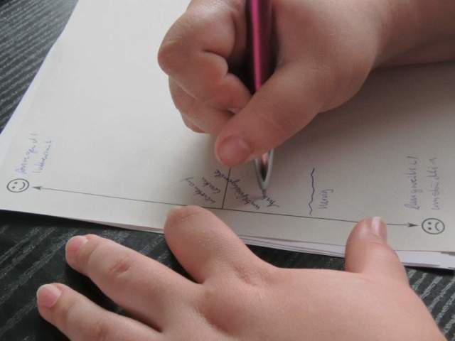 Image: diagram_beginFillOut
-
The basic process
One example would be graphing good and bad phases of an experience over time – like this:
The template is just a sheet of paper with the axis and their labels (and possibly a miniature example of a finished graph)
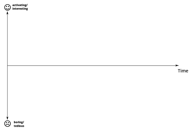 Image: Good-Time/BadTime-Diagramm
The researcher needs to introduce the process to the participant:
I am interested in the activities and experiences you like or don’t like and how they line up.
Could you draw a graph of how you felt during the project and write which activities were connected to these feelings? A finished diagram can look like this [shows example]. While you draw, just explain me what you draw so I can understand it better.
Or more abstract:
- State your interest
- Explain how to use the diagram
- Ask for explanations during the drawing
While the diagrams itself are an important outcome, don’t forget to note the participants utterances and/or to make an audio recording.
Make it suit your needs
There are many different forms of mappings which you can use for user research.
Some examples:
Diagramming Feelings
Just like in the example above you can ask your participants to draw the course of their feelings over a specific time and to annotate this graph.
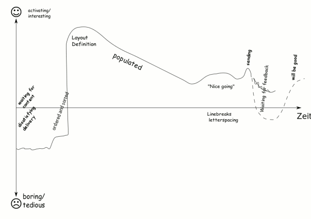 Image: U1_GoodBadTime_Diagramm
Social diagram
Ask to map the connections and tasks of people the participant works with.
 Image: diagram_people
Note that the diagram does not just include individuals the participant directly worked with; Books are mentioned too. If participants ask if they may include something (e.g. books instead of only persons) encourage them to do it and use the additional data.
Process diagram
 Image: Mapping Process
Ask to draw and annotate a diagram of the workflow: What tasks need to be done? Why? How are decisions made?
If possible ask for demonstrations of the activities while they are added.
… your own creations
It is a great idea to create your own template is existing ones do not suit your needs. Just keep in mind that it should easy to fill out and test it at least by using it yourself or ideally in a pre-reserach session.
Advantages
I think that this has several advantages for beginners in user research since the template provides some predefined structure:
- Participant and Researcher alike feel more secure it is rather clear what can happen and what is expected
- Asking about processes and motivations can be tough for beginners; the template can help to get to know about these.
In addition there are some advantages because of the graphical nature of research
- It is easy to point to data like »you wrote/said/drew… this – what does it mean?«
- The data can be analysed graphically by comparing patters.
Analysis
Annotate the diagrams
Annotate the mappings directly after the research session when your memory is still fresh. Supplement the drawings from you memory and add utterances which you remember and rewrite annotations which are unclear. If you don’t you miss out some data and the diagram will be hard to understand when you can’t decipher the handwriting of the participant.
Search for patterns
To find patterns across participants, put all diagrams of the same kind side by side. See if there are similarities or contrasting patterns, find reoccuring data as well as unique events.
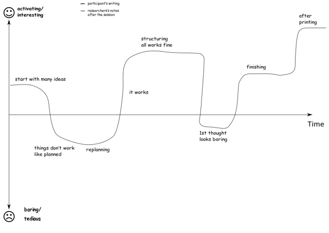
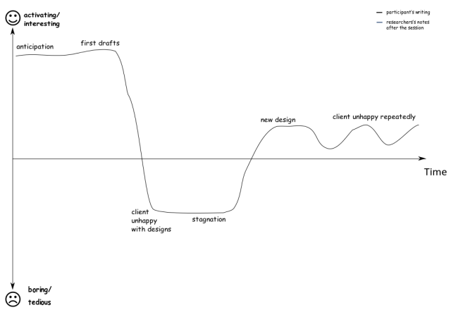
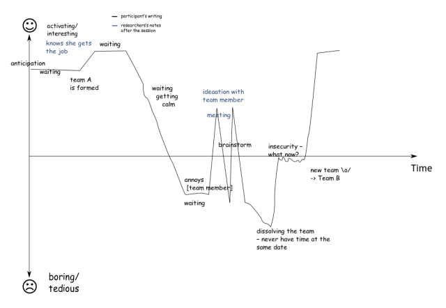
Example Analysis on the diagrams above
- In all but one diagram the onset of a project seems to be a good experience
- In three of the five diagrams there is a significant decline after the projects first, motivated phase. The reasons are: Seemingly unsolvable problems, project not going according to the plan and unhappy clients. A commonality is that the named reasons for the bad mood are seemingly out of the control of the participants.
- for all participants the project ends good, while four of them seem to be very happy at the end: Finishing seems to be a good experience.
reasons for being happy:
- project onset
- ideation
- design works like hoped or expected
- project end
reasons for being unhappy
- »unsolvable problems«
- client does not like the design
- self critique
- insufficient starting material
Wrap up
I hope that the examples for possible diagrams and their analysis gives you an idea of how to use diagrams for your own research. If you do, write some comments on your experiences.
Edit (9.2.2015): The page I hosted the .svgs on is down. But they found a new home, so download the social map and thefeelings map from the Medienwiki.
Edit (10.1.2015): Since the images are only .png, here the original svgs. Have fun using and improving them (according toCreative Commons 4.0 BY).
* Edit (2.1.2015): The text and the photos and illustrations may be used according to the Creative Commons 4.0 BY License*
* *